 Skip to content


-
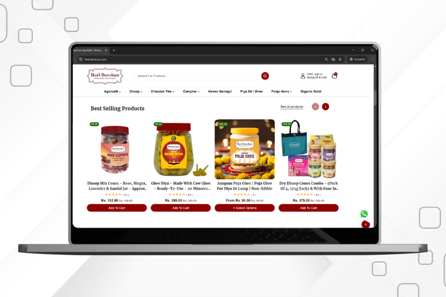
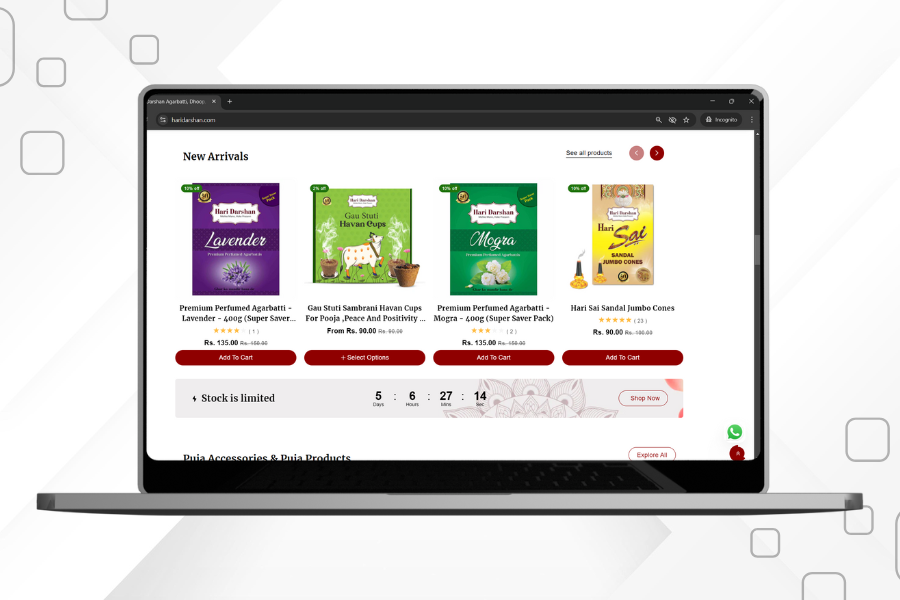
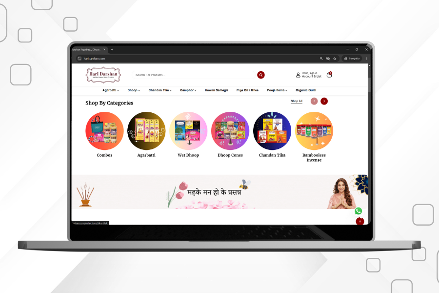
Interface
-
Design
-
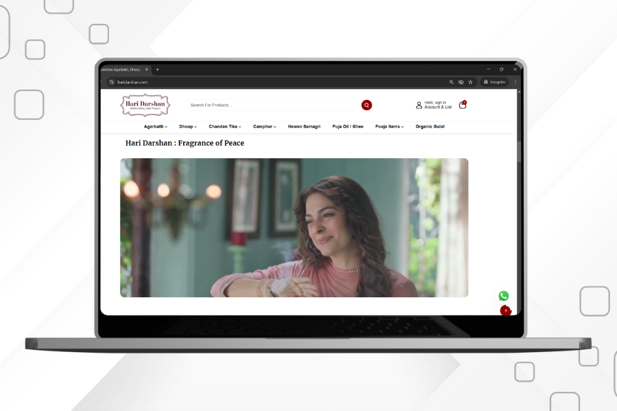
User Experience

-
The New Design That Inspires Joy and Tranquility
-
The User Experience That Educates and Connects
-
Optimized for Performance and Mobile Accessibility


4.9 STAR RATINGS
On Trustopilot

GOOGLE PARTNERS
Certified Experts

ISO CERTIFIED
Certified Service Standards

4.9 ON GOOGLE
High Google Ratings